— Case study
Branding for
5Y investments
Our job was to design a Logo and stationaries for a Dubai based investment company – 5Y Investments. Read through this case study to know how we arrived at the finished product starting from sketching to final lettering and image.
A design that mix “5Y” within
Our task
Logo is definitely the key element for any branding and marketing. Designing it takes a lot of research, understanding of design laws, colors and combination of magical ingredients. “Well get me a unique and attractive logo”, most client says. Creating a unique logo is not an easy task because there are plenty of brands out there. However, a skilled designer can somehow sneak through it to create a brand symbol that can stand out among million brands.
Requirements
Most clients come with a simple requirement, “Unique, should speak business and attractive”. So what did our client say?
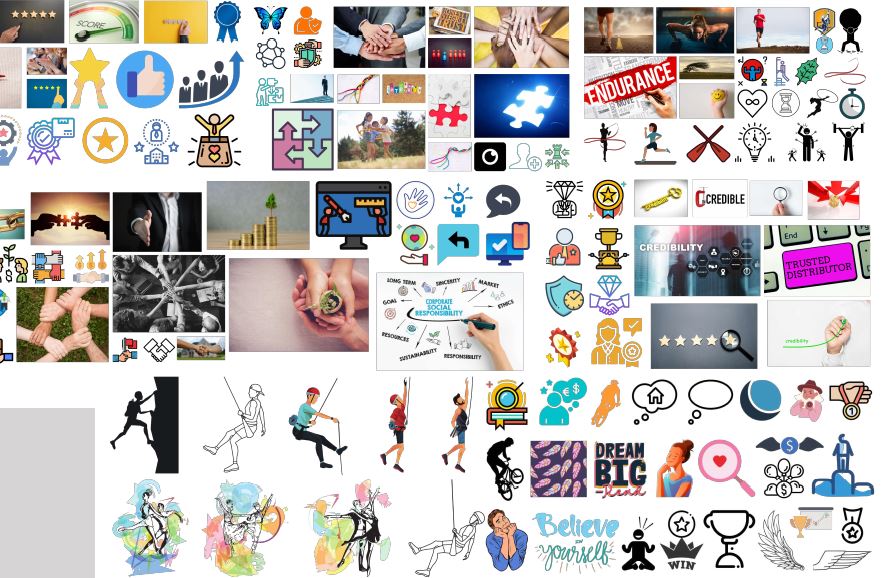
A design that mix “5Y” within, unique, attributes that define the company – integrity, credibility, excellence, partnership and social responsibility.
Well, that’s big enough requirement isn’t? We still need to understand what “5Y” means and the client said “is the number of family members”. Ah! got that, “but where is your business put up” – we asked the client and “in Arabic region” said the client.
Later in the day, we pinged the client asking what is the message they like to convey in the logo.
“Tenacity, endurance in the pursuit of dreams”, the client replied.
Process
Our Process
The client represented a startup business based on the idea of financial institution engaged in investments. So our job was to create a logo that the company can use in various products and in social media sites.
“Tenacity, endurance, pursuit of dreams”, the words that define the brand perspective. “Integrity, credibility, excellence, partnership and social responsibility”, the attributes and keywords of the business. Well, we combined those keywords and transformed it into a single image.

The First concept
The keywords and attributes combined in the image helped to derive the subjects:
In motion/potential
Strong base/ground/bond
Flexible/combined element
That said, our concept is going to feature something like this.
Brand perspective + Momentum/pace + 5Y Lettering.
Initial Sketches
The designer came up with the initial sketches that contained illustrations combining the attributes and various perspectives of the brand. Also the designer worked on several support illustrations; the secondary illustration were focused mainly on shapes representing the letter 5 in both the English and Arabic.
Construction
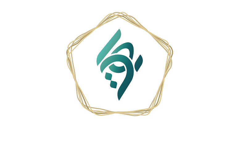
The idea revolved mainly around the letter 5Y, the brand perspective were represented in a shape of a hand with gems explaining the integrity and its credibility towards the motive. The number 5 in English constructed into a shape to represent the pace/potential and the letter Y was illustrated to define the tenacity, endurance and excellence. Finally the number 5 in Arabic was designed such that it represents the great potential in achieving the dream-quite predictable about the achievement. And the designer also made sure that the symbol does contain up to 5 elements representing the five members of the family.
The client liked the concept and the meaning of each element in the logo, but came up with few suggestions to make it better. After incorporating their feedback, the designer moved on to the next stage which requires working with colors and polishing the details. The color palette was selected based on the client’s expectations.
Have a look at the finished logo.

Moving on to stationary:
Once the logo was done, the next task was to design visiting card, letter head and envelop for the brand. The design again went through multiple iterations and revisions to meet the customer’s expectation.

